I’ve noticed that the local desktop app isn’t the clearest when something triggers an alert so I’d suggest a dark mode or higher contrast coloring to help with this. I don’t see the reason to limit local notifications on the local app but at least this will semi-help with alerts.
thanks for sharing the feedback @cben2142.
i am not sure what part in the interface in not the clearest. can you please share a screenshot to help understand this better? thanks!
@ajitk
It’s the coloring. When an alert goes off it’s highlighted in white but the background is an off-white blue and it’s hard to see. If the colors contrasted more it would be a lot easier to tell there’s an alert.
i see. here is a screenshot displaying background, unread and read monitors in the watchlist.
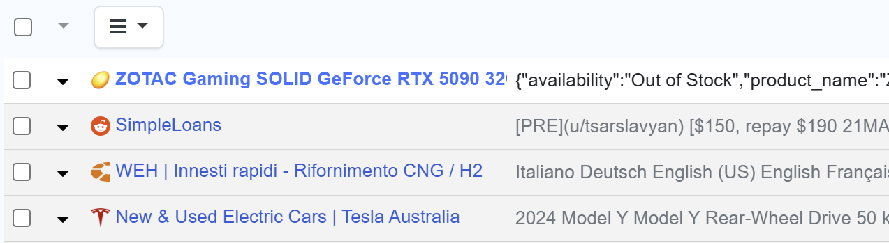
like you said, the unread monitor doesn’t contrast well with the background.
is the unread easy or hard to differentiate from the read one @cben2142?
Yup, exactly. If colors were customizable it would probably be more ideal than different themes or different color highlight only.
interesting. i found it easy to distinguish read and unread apart. but i also understand that it can and does vary from person to person. we have plans for shipping dark mode later this year and will also consider a high contrast mode when we do. thanks!
the dark mode support has now been released for the desktop app. check it out and let me know your thoughts.
1 Like